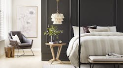
After a tumultuous year, people are seeking calm in every area of their lives, says Sue Wadden, director of color marketing at Sherwin-Williams. Sherwin-Williams’ color of the year—a rich, warm brown named Urbane Bronze—reflects that need for sanctuary and balance.
“The pandemic has caused us to seek comfort in our surroundings and be mindful of how we’re living,” says Wadden. “As a result, the focus in design and color has shifted to building relaxing sanctuaries within our existing spaces and interior paint colors can help accomplish this feeling. Urbane Bronze creates a sense of calm while making us feel safe and secure.”
Urbane Bronze is a departure from the cool neutrals of the 2010s, Wadden adds. It was chosen from the Sanctuary palette, a collection of earthy neutrals that make spaces feel grounded, in Sherwin-Williams’ annual Colormix forecast.
It’s ideal for anywhere that requires a sense of comfort, whether that’s a residential or commercial space. “It can be used in a variety of interior and exterior spaces, including hotels, restaurants and hospitals,” Wadden says. “It looks great as an accent wall in a hotel lobby, on the restaurant bar or in a meeting room.”
Nature-inspired colors like the Sanctuary palette are also perfect for spaces that draw on biophilic design, Wadden adds. She recommends pairing it with “contrasting shades of beige, parchment and mushroom, such as Modern Gray SW 7632 or Messenger Bag SW 7740. In addition, wood species like ash, woven wool rugs and copper help play up the rich hue and complement it beautifully.”
Read more color reveal stories here:
Wellness Inspires 2021 Color Palette of the Year from PPG
Valspar’s 2021 Colors of the Year Aim to Bring Serenity and Calm into Your Space
5 Tips on How to Use Graham & Brown’s Color of the Year: Epoch
Immerse Yourself in Color with HGTV Home’s 2021 Color Collection of the Year

