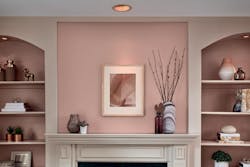
Valspar’s 2021 Colors of the Year Aim to Bring Serenity and Calm into Your Space
Valspar’s 2021 colors of the year are very much a reflection of 2020. Homeowners and designers have faced a bevy of external stressors during this tumultuous year, and Valspar’s new 12-color collection aims to bring serenity and calm to any built environment—“blending home improvement with self-improvement,” according to a press release.
When curating this collection, the team at Valspar observed how consumers’ lifestyles at home have changed in 2020—from more time spent at home to an increased affinity for DIY projects—and they also looked at general trends in fashion, technology, and sustainability and how these categories are moving and shifting for 2021.
“We want consumers to feel healing through these colors,” says Sue Kim, color marketing manager for Valspar. “Each color has its own personality and mood. And each color is carefully selected to reflect that mindfulness and self-care.”
As the design aesthetics between home and an office or hotel environment continue to blur, commercial and hospitality designers will find these colors especially helpful when looking to design a more serene space.
The collection includes natural blues, strong neutrals and plenty of warm tones.
“I really believe blues are coming in strong for the next five years and even this next decade,” Kim says. “I really love Blissful Blue—it has a great natural feel to it…We explored a lot of warm tones too. Vintage colors we’re familiar with. Colors like Maple Leaf that are more earthy and authentic. Almost evoking the imagery of pottery, but not muddy, really more yellow and orange tones to make it more livable.”
Valspar’s 2021 Colors of the Year
All 12 of Valspar’s 2021 colors are available at Lowe’s and independent retailers.
- Blissful Blue: a muted indigo.
- Lowe’s: 4005-3C Blissful Blue
- Independent retailers: V111-4 Norwegian Night
- Soft Candlelight: a mature yellow with a “golden glow.”
- Lowe’s: 3005-6C Soft Candlelight
- Independent retailers: V050-1 Morning Blossom
- Granite Dust: inspired by the protective qualities of natural stone.
- Lowe’s: 5006-1C Granite Dust
- Independent retailers: V142-3 Gray-Green Linen
- Cherry Taupe: a botanical, earthy neutral.
- Lowe’s: 1005-10A Cherry Taupe
- Independent retailers: V081-4 Burnished Apricot
- Arizona Dust: a modern shade of apricot.
- Lowe’s: 2003-8A Arizona Dust
- Independent retailers: V045-3 Peach Squared
- Garden Flower: a fresh floral tint inspired by “the beauty of white roses.”
- Lowe’s: 5004-3B Garden Flower
- Independent retailers: V097-2 Succulent
- Academy Gray: a deep blueish gray.
- Lowe’s: 5001-2A Academy Gray
- Independent retailers: V138-5 Flannel Gray
- Unforgettable: a warm, sophisticated white.
- Lowe’s: 7003-2 Unforgettable
- Independent retailers: V094-1 Quill
- Gallery Gray: a warm, natural gray.
- Lowe’s: 2006-10B Gallery Gray
- Independent retailers: V133-4 Gentry Grey
- Dusty Lavender: a shadowy pastel.
- Lowe’s: 1002-7C Dusty Lavender
- Independent retailers: V078-4 Violet Dusk
- Maple Leaf: a warm camel shade.
- Lowe’s: 2008-8B Maple Leaf
- Independent retailers: V089-2 Spiced Latte
- Lucy Blue: a playful blue, “like the waves of the ocean.”
- Lowe’s: 5001-5C Lucy Blue
- Independent retailers: V103-4 Grand Boulevard
Read more color reveal stories here:
HGTV Home by Sherwin-Williams 2021 Color Collection of the Year

