Sophisticated, yet friendly, professional, yet hospitable, tech-friendly, yet biophilic, Perkins&Will (P&W) had its hands full striking that perfect balance for the needs of an international law firm establishing their presence in Austin, Texas.
The client sought a timeless, yet contextual design that would speak to the firm’s culture and work style, bringing in both local elements and references to their brand. P&W got to work, collaborating closely with the client to gain a thorough and detailed understanding of their needs, space program, work requirements and how they envisioned their new offices.
Regional and Historic Inspiration
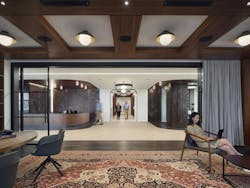
Stepping through the entryway, clients and employees encounter a large, open space referencing the vast Texan landscape. A selection of wood, stone and dark metals further invoke the local vernacular. Lines and circles are woven into the ceiling plane as hidden references to binary elements within the company’s branding while evoking an expression of form and function. The dark wood framing of the reception area presents both the traditional formal look of law offices while simultaneously representing Austin’s cool, tech-inspired aesthetics with the sleek wood design.
“The contrast between the distressed metal on the walls with the warm and refined wood panel detailing brings an eclectic and regional edge to the space,” explained Lina Murillo, RID, LEED AP BD+C, interior design principal, Perkins&Will, Austin.
The selection of area rugs and textured drapery in the casual gathering area down the hallway creates a residential feel and enhances acoustics. A telescoping glass front enclosure can also be closed to provide a more private meeting space.
Harmonious Design, Front to Back
Serving as the offices’ main “front of house” hospitality space, the bookcases are lined with books, art and a record player for old and new records of local musicians, celebrating Austin’s vibrant music scene. The room is also outfitted with speakers and AV systems for meetings and collaboration, and as a music lounge for entertaining.
Directly next to the reception area is a catering bar that also serves the conference center on the other side of the hallway. The front desk design carries directly through into the hospitality bar where a metal mesh partition creates a separation while still allowing visual continuity. The corridor ceiling is designed with a linear appearance as another reference to the company’s brand.
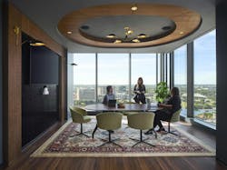
In a prominent corner office with two sides of floor-to-ceiling windows showcasing the Austin skyline, a touch of greenery complements this collaborative meeting area. Once again, the brand’s binary lines and circles are expressed in the architecture.
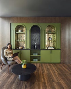
On the other side of the room is a speakeasy-inspired breakfront bringing culture and historic context to the space.
“The idea of the ‘speakeasy’ was inspired by the office’s downtown location, its traditional buildings and surroundings, and how some local businesses have evoked the old Austin nostalgia of the bar/pub,” explained Murillo.
Overall, the design sought to achieve an “Eclectic Harmony” in creating special moments within the space with an unexpected twist. This includes celebrating “Old Austin” with dark materials, colorful and vibrant elements, patterned glass and traditional wallpaper evoking a period design as well as showcasing bat-like patterns to reference the city’s bat colonies residing under the Congress Avenue bridge downtown.
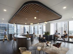
In another daylit corner is the break room, designed to evoke a sophisticated and modern coffee bar vibe. Murillo describes the spaces as a fun wellness hub destination for both employees and clients.
The linear acoustic wood ceiling and curvilinear components once again incorporate the firm’s brand language while also bringing a hospitality vibe to the space. The space extends into a lounge area with a comfortable section of seating options, providing employees with alternative spaces for collaboration and activity-based working.
User-Focused Design
Ultimately, the designers delivered a space which was very much in line with what the client had desired. But reaching that point of truly understanding the firm’s needs was a very collaborative and engaging design process with the client.
“Through a series of test fitting and layout plans and exploring precedent space typology images highlighting experiences and emotions, materiality, furniture and graphics, we were able to capture the vision the team had for their space and contextualize these ideas to the design with Austin’s locale,” Murillo recalled.
As the design progressed through schematic and design development, the team utilized digital 3D visuals such as black and white views to understand space and interior massing. In addition, realistic renderings were shared with the lawyers and stakeholders to help them better understand the functionality and aesthetics of the different spaces. This process was enhanced with material samples and finishes to best strike the Austin vernacular and hospitality look the client was after.
“We looked at different wood tones, stone surfaces and textural metals to bring the ‘Eclectic Harmony’ design concept to life as a hospitable experience focused on local vibes with sophisticated and unexpected moments,” she explained.
The final product and material selections were also guided by user-centered, sustainable design principles. This included only specifying materials from P&W’s “Precautionary List,” to ensure that they were free of substances of concern for end users.
Thermal comfort is ensured with the incorporation of thermal zoning and controls. Optimized daylighting, fully dimmable lighting and low-flow faucets complement the eco-friendly design.
Acoustics were another client priority, particularly for the conferencing, breakroom and reception areas. Together with the acoustic consultant, the team selected “wood like” PET acoustic ceilings, and smooth and light-colored acoustic ceiling tiles to resemble a drywall ceiling application.
In private office areas and conference rooms, all partitions were extended to deck to minimize sound transfer through the spaces, and acoustics were enhanced by soft surfaces like acoustic ceiling tiles, carpet, furnishings and drapery, according to Murillo. To ensure high STC ratings of 35 and 45, office and conference areas had demountable glass fronts. Other acoustical design strategies include sound boots on return air devices, and a white noise system to reduce sound carry between spaces.
Content in their new offices, employees and clients are enjoying the upscale, dynamic spaces embracing regional Austin materials, culture and history.


