Looking for a space to support its rapidly growing team, Ducera was happy to find close to 30,000 square feet with 360-degree views, tall ceilings and great daylighting in this Times Square high rise. To start customizing this signature office space, TMA quickly latched on to the interlocking geometry in Ducera’s logo and generously played with the design throughout the office. Beginning with the elevator lobby, a mirrored wall with black mullion lines and interlocking diagonals references the logo and sets the interior palette scene of soft, warm neutral shades with gray couches, wooden walls and porcelain flooring. The first of many pieces of artwork is displayed on a pedestal here in the corner.
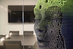
“We placed artwork throughout the space to act as landmarks and focal points to add interest and highlight the client's art collection which he was very proud of,” explained Jeff Knoll, studio design principal at TMA.The hallway’s Arktura acoustic ceiling tile features striking metal strips and doubles as an access point for the AC units and ductwork hidden above. “Typically, a sheetrock ceiling would be used for such an application, but that’s a very monolithic material and then the quality of those access panels would be very apparent and unsightly,” said Knoll. “This pushed us to explore other materials on the marketplace.” Not only does the Arktura product offer a simple, flat, thin and accessible tile, but it seamlessly ties into Ducera’s geometric-shaped logo design.
At the end of the hallway sits a simple reception desk which doubles as a bar for after-hours social events.
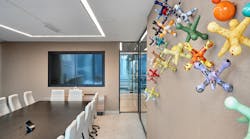
The conference rooms were designed in a variety of sizes and scale, enhancing that sculptural quality as the spaces play off the mirrored reflections and outdoor views. As an homage to those views of the “Center of the Universe,” a neon framed sign is purposely located on a window overlooking Times Square. Another art piece of note is the installation of colorful jacks, seemingly sprayed across the wall in one conference room.
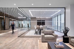
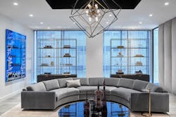
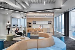
The space dedicated to one-to-one client meetings begins to pivot the project over to a high-end residential aesthetic with sectional gray sofas in a semicircle, upholstered wall panels and a hanging light pendant that also mimics the Ducera logo. More artwork and thoughtfully spaced, curated items on the metal shelves behind the couch and on top of the central coffee table include purple antique Venetian glass and Amethyst minerals.A staff lounge area features a café space with wooden cabinets, chairs and a table. It then fans out into a carpeted area with serpentine soft seating where employees can relax, work in a different setting or hold an informal meeting. The mirror theme is extended here as well, reflecting light and creating a greater sense of depth.
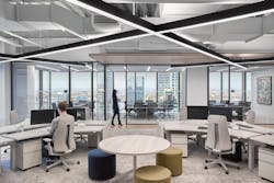
“This space was also intended as a growth area if the client were to require additional workstations. The seating could easily be removed and replaced with desks,” he added. Work zones feature exposed ceilings to take advantage of the room height and the light fixtures run at a diagonal, tying back once again to the geometrics of the firm’s logo.
Staff members are reporting that the bold, defined aesthetic and open floor plan have helped build their community and company culture—and they’ve got the accolades to prove it. The project was awarded CoreNet Global’s New York City chapter’s Project of the Year in their 2022 Corporate Real Estate Awards for Excellence in the 25,000-100,000-sq.-ft. category.
“To have our work for Ducera Partners be recognized with the CoreNet 2022 Corporate Real Estate Award for Excellence is a testament that we are successfully leaving a lasting positive experience on the workforce community,” stated Ted Moudis, senior principal. “At a time when the commercial real estate industry needs new solutions for encouraging employees to return to the office, workplaces that emphasize thoughtful functionality and collaboration are paramount.”
