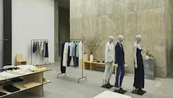
Today’s brick-and-mortar retail stores have evolved into interactive billboards. It's not just about providing a physical space to make purchases for that dwindling customer set not so comfortable with the digital transaction yet (or who can’t do without setting eyes on the actual product); it's about creating an immersive experience that creates a pathway to a brand’s e-commerce presence. Today’s customer is getting to know a brand via its in-store experience and often completing the shopping process online. Let’s take a dive into what helps them along the way.
The Consumer
First, let’s get to know today’s consumer: they are inundated with options, making online shopping a jaded experience. They can also be influenced by multiple social media platforms. All their options can be purchased by a click and are always at their fingertips. With all these options, I think it’s important to consumers today to know they are making conscious purchases and are shopping with a sense of identity. People want to buy from a brand that they themselves align with, feel a personal connection with, or get a feeling from, which is difficult to achieve only through an online presence.
So they need brick-and-mortar to go well beyond mere product displays. Take the clothing brand Theory: when designing their stores, we illustrated their aesthetic with fewer SKUs displayed on the floor, while also making customers aware that their online platform supplements their options with digital screens or signage with product descriptions. That also involved positioning product fixtures so that sales associates could see and approach customers to provide further information.
The Experience
In store, it’s more about the customer experience than showcasing all the brand offers. You’re here to learn more about their message while the actual purchasing part can happen online. Connecting the two worlds is what garners repeat customers.
Consider how color affects mood and shopping habits. Acoustic solutions can help reduce noise for a more relaxed and focused visit, and even scent can be used to create a lasting impression and connection to a brand. So many details can make an impact on shoppers in-store, even when they’re just browsing. Put yourself in their shoes as you walk through a space and ask yourself these questions:
• Where are you putting down your things?
• What kind of surfaces are in the store?
• Where can you sit?
• Is the POS visible?
• Can you see the exchange of money?
• Are you offered a beverage? If so, what kind of cup is it in?
These are all elements that make a difference to the modern consumer, despite likely being an online shopper.
The Layout
The floor plan dictates how a brand’s story unfolds in-store and how the customer might navigate it and come to know it.
Consider the following:
• Putting a new collection in the front of the store with basics in the back to supplement more unique pieces.
• Realize the importance of furniture and art selection and placement to supplement fixtures. Customer seating can be a major flex, choosing pieces by famous designers.
• Fixtures need to be thoughtfully designed. If the brand wants to showcase a single product or initiative/new collection the fixture needs to allow for that, making it clear that’s where the customer should focus their attention.
• Work with your client to activate the space. For example, we integrated a coffee bar at Theory SoHo in New York City.
• Cater to all comfort levels in the fitting room experience, from those who want to step out while trying on vs. those who want to in private). Large mirrors and appropriate lighting should be considered.
This has turned physical stores into marketing tools, rather than their bread-and-butter. While a visitor to the store may not actually do any shopping there, they can learn about the company, what it offers, and develop an opinion based on that in-person experience. Because after all, an actual on-site visit will always offer a more personalized experience compared to accessing a website.
The Design
Walking into a store creates a vibe; it should make you feel a way that makes you want to purchase. Let’s look at these two NYC projects as examples:
Theory Hudson Yards*
Hudson Yards is a tourist destination. From anecdotes from sales associates, tourists have stopped into Theory because they were intrigued by the poured concrete walls and minimalistic design because it aligns with their own minimal aesthetic, or it just makes them feel inspired to shop. These tourists had never heard of the brand prior to the visit but planned to shop online after discovering the space.
Zadig and Voltaire TriBeCa
(Designed in conjunction with Stephan Wiemer.)
Zadig and Voltaire features a triangular space with ample glass storefront but minimal surface area for product. The spaces were designed as a marketing tool, with sales as a plus. Located on a busy intersection on 6th Avenue, the brand wanted to push their presence and relationship to New York City, and to be relatable/engage with the neighborhood’s inhabitants (at the pedestrian scale). The choice in fixtures, lighting and materiality were planned to relate to the commuter traffic scale—people driving by could experience the large-scale fixtures, see a concrete massing through the glass storefront, and see the product through directional spotlights.
Visitors can also learn about Zadig & Voltaire’s design concepts inspired by the neighborhood’s art galleries. This is what the brand aligns with and aspires to. Department stores cannot appropriately represent the vision for these kinds of brands as they often have company design standards that prevent brands from representing themselves through the design elements outlined above (fixtures, wall finishes, lighting). The product needs to stand alone and speak for itself. Also sometimes at department stores, brands are mixed in together, leaving the customer to either have to know what they’re looking for in order to find it, or stumble upon it. The difference with stand alone stores (or shop in shops at department stores) is that the customer is drawn into the space by its design, whether the brand is recognizable because of its design elements or a new customer is drawn in by a unique experience.
Brand owners need to understand that brick-and-mortar is now more of a tool in their marketing and advertising program rather than a major source of income. In my experience when budgets for stores have been built, it’s less about how much the brand will profit in sales and more about the impact the physical space makes for the brand/gaining clients. Regardless of how the actual transaction is made, shoppers want to get to know a brand in person and gain that familiarity to feel more comfortable following up with an online purchase.
*Theory Hudson Yards was a project Nicki Gitlin contributed to prior to starting her own firm, dang.
About the Author
Nicki Gitlin
Nicki Gitlin is the owner and founder of dang Design and Architecture. Gitlin’s practice is always built off a collaboration with clients and her previous experiences, in order to realize their visions through design problem-solving. She creates spaces that people want to spend time in and discover.


