dash dine Drives the Latest Iteration of Chef Jose Garces' Amada Restaurants
While NYC-based dash design already had a 10-year history with Philadelphia’s Garces Group of one-of-a-kind dining experiences from Chef Jose Garces, this go around would be different. For the next location of its Amada restaurants, they requested that their longtime partner establish a strong concept and schematic design—so they could take it and run.
Seeing as a complete gut renovation was not necessary and that Garces Group had to remain conscious of where they spent their money, dash dine (a division of dash design) was not hired for their usual soup to nuts role. Instead, once a direction was established, Garces team did the leg work when it came to nailing down a location, purchasing and styling, establishing weekly check-ins with dash dine Design Director Kristin Cullen to help manage it all.
“We knew we weren’t going to able to touch every little thing,” she explained. “So, it was a lesson in identifying at the onset what our goals were, what the brand DNA is and how we would change the space so that guests had a different experience from previous visits.”
But a consultancy role for dash dine was not the only way Garces was able to save some green. Let’s learn how both client and firm worked together to keep costs low and design expectations high.
Good Bones
With locations already in Atlantic City, NJ and Philadelphia proper, Garces was one of a group of chefs dipping their toes into the city’s surrounding neighborhoods—a movement spurred by the hybrid work style the pandemic normalized. “With so many people moving out of Philly or working remotely, they really wanted Amada to be more in their backyard rather than making people go into the city,” explained Cullen.
Upon entering Radnor, a township in Philadelphia’s Main Line suburbs, the team found their biggest savings resource: a space that checked all the boxes. Not only did kitchen, bar and restrooms all work exactly where they stood, but it also had an open kitchen and wood fire grill—an element Garces had been wanting to bring into the Amada brand for years.
“We didn’t need to change much,” she said, except for two main design moves that truly elevated the guest experience.
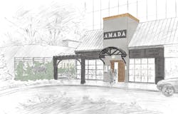
Located in an office building that is part of a larger campus, the space had two previous dining iterations under its belt before becoming the Amada Radnor. “We wanted it instantly recognizable as a brand-new project,” so a large focus was placed on transforming the arrival and entry. Replacing a set of glass and steel doors were heavy, reclaimed wooden doors from Rustica, followed by a foyer to add a sense of anticipation before guests turned in to be greeted by the host. This avoided having them walk straight into the bar area.
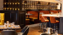
Once inside, the layout needed to do more to build up the intimate atmosphere this Spanish tapas-style restaurant is known for, which involved integrating the brand’s signature: glowing, Andalusian-styled lanterns.
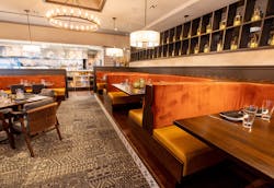
“It felt too expansive between the bar and main dining area,” Cullen said. Feature shelving with the lanterns layered in wraps between the two zones and provides a buffer that still allows the vibe to flow between them, and also helps in phasing between the seating of lunch and dinner.
Makin’ it Work
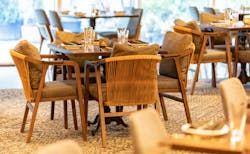
The team had to check their ego at the door, as they knew timing and budget wouldn’t allow for much custom work. “With one of our biggest goals being to treat the façade, we knew that’s where a decent portion of the money was going to go”—so when it came to interior specs, mostly running line products is where it’s at. “It was about conceptualizing what was the right feel and also being flexible enough with ourselves and the client to say we might not get our first option. We need to feel ok with the second or third option but it all has to work together, so we constantly strategized to make sure it did.” FLOR carpet tiles were used for another tie-back to the Andalusian region of Spain with the Moorish patterns and textures it’s known for. Some seating came from sohoConcept, while others like the bar stools were repurposed from another Garces property. Millwork, banquettes and tables did require more attention and local fabricators were relied on for their expertise to help keep costs associated down.
Another move that helped financially was a realistic outlook on phasing in parts of the design, such as with the two semi-private outdoor dining spaces which didn’t need to be ready for day one (as opening was March 2023 with colder temps still running strong).
Dash is in the Details
Styling is a dash specialty, but one that also was (mostly) handed over to the client. But all it took to avoid any static in achieving that chic, eclectic vibe the firm is known for was to keep steadfast in that dedicated communication they’d all maintained throughout the project.
“We worked hand-in-hand with Garce’s Chief Operating Officer Scott Campanella who is super passionate about the restaurant industry and the arts in general – he has a very creative head. And I’d get texts from him on the weekends while he was out shopping, asking ‘Does this work?’ ‘Does this not work?’” Cullen laughed.
Pieces like the brand’s iconic Iberian pig statue that can be found throughout its locations and the seemingly random yet somehow perfectly fitting hat stand full of Panama hats (inspired by another Garces property in Atlantic City they’d also developed together) provide a sexy enchantment that gives this Amada an identity all its own.
Overall, the project was a lesson in letting go: of control, preconceived notions and expectations. “Because often owners and designers want to go in, do a gut reno, have your stamp on it and have everything be just right.” And while the process didn’t run as it usually does for either side, their partnership still resulted in a spot that lives up to both their reputations for providing dining experiences like no other.
About the Author
AnnMarie Martin
Editor-in-Chief
AnnMarie is the former Editor in Chief of i+s and has been covering the commercial design space. Her style and vision has helped the brand evolve into a thought leader in purpose-driven design and cultural movements shaping the way we live and work.


