As Mission Bay’s very first hotel and San Francisco’s first new-build hotel in more than a decade, the LEED Silver-certified LUMA Hotel’s journey to completion and opening last year was an unusually long one.
The results were obviously a resounding success with LUMA being ranked as Tripadvisor’s Best New Hotel in the U.S. for 2023, in large part thanks to the thoughtfully curated interiors from California’s Cole Martinez Curtis and Associates which showcase spectacular views of the Bay and San Francisco Giants’ Oracle Park, celebrate the site’s history as wetlands and appeal to the neighborhood’s high-tech/bio-tech industry and business travelers alike.
And it packs a punch for such a relatively small footprint with 17 stories of 299 guest rooms and suites, amenities, a rooftop lounge and 7,250 square feet of meeting space. Much thought and planning went into making the different parts of the hotel appear more spacious.
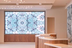
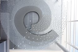
“It’s a really small, post-stamp sized property,” joked Jill Cole, managing principal and president. A small lobby with glass walls flows off of a small porte cochere to make everything feel more open. Stepping into the lobby, the eye is drawn to a dimensional mural entitled “Memory Tides” depicting an aerial view of the wetlands and salt pods formerly occupying the Mission Bay neighborhood before the city began filling in the marsh with rock, sand and dirt in the late 1800s. The crisp, white flooring and surfaces combine with wood paneling to create a modern, high-tech look, enhanced by a large video screen of rotating art commissions. Chairs with flowered fabric were chosen to play against the room’s techy design and help illustrate a residential side of its character as well.Next to the lobby is a three-story, glass-enclosed atrium serving up pastries and San Francisco Sightglass Coffee. The space features flexible, movable furniture in the hotel’s signature color palette of muted blues, greens and grays. “We tried to play off the colors and textures of the wetlands. It’s subdued and very quiet with small pops of color,” said Cole. The atrium also features an elaborate light sculpture, crafted by local artist Jim Campbell.
Named “Helical Trace,” the piece is a showstopper as the 4,000 wires wind down from the ceiling, each ending in a single LED light, embodying the hotel’s name, which is a digital term for brightness.The blue-based color scheme continues to flow through the property and into the first floor Community room with a blue textured wall, blue and grey chairs, and green plantings. The furniture can be easily reconfigured, and the table is integrated with USB ports and electrical outlets. In place of overhead lighting, the design team went with library-like desk lighting to avoid glare and upgrade the aesthetic.
Next to the atrium, serving as a pre-function area to the classrooms/conference rooms surrounding it, is the Gather space featuring a blue ceiling and carpeting, warm lighting and wood-paneled columns and walls. “The blue gives the eye some relief as you come out of your meeting,” Cole explained, and follows you up to your room.
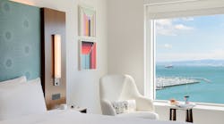
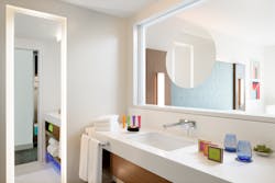
The blue headboard is flanked by custom-designed sconces attached to wood panels. Lighting is also integrated into the top of the headboard and creates a soft glow. Flooring is made from recyclable materials and motion sensors reduce electrical lighting consumption.But the main focus of the guestrooms was finding ways to offer up, if nothing else, the illusion of more space. “We wanted to play to the views as much as possible to enjoy the outdoors wherever you’re sitting,” explained Cole. “It was challenging figuring out where to put the furniture and working around structural columns to achieve this.” So, extra-large picture windows with mechanical privacy shades offer spectacular scenes of the ocean and ballpark. To enhance these vistas, the walls and ceiling are white and the furniture is light colored. Wooden closets are open and the bathroom mirror is set in a window facing the bedroom.
This high level of planning and coordination continued throughout the entire project, with constant back and forth between the owner, interior designers, architects, structural, electrical and mechanical engineers.
“It was very intense. What each does affects the other disciplines, so we basically lived together for several years, sharing drawings, concepts and ideas, and constantly communicating,” she explained. “For example, small details like how to put power behind the headboard and locating the bathroom sink faucets on the wall to help keep the counters clean may look simple—but it wasn’t.”
After laboring over the project for so many years, all involved were thrilled to see the project finally open its doors to the burgeoning Misson Bay community. It’s certainly making a splash not only in its own neighborhood but the travel industry as a whole.
