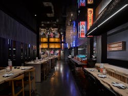
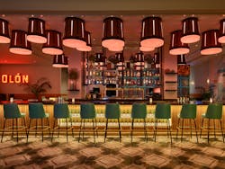
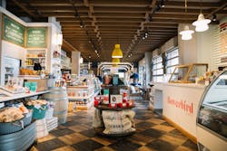
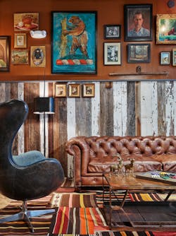
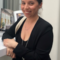
With restaurant design at the intersection of his career within the hospitality, entertainment and retail markets, it was kismet for founder and president of NYC’s dash design, David Ashen, to start a division dedicated exclusively to it—and to place firm leader Kristin Cullen at the helm.
They’ve already got some yummy projects cookin’ up, from various confidential branded F&B concepts in the Florida Keys to a 13,000-sq.-ft. café for a global tech company in New York City, not to mention two recently completed projects for the Garces Group (Amada in Radnor, Penn. and Garces Eats at the Wells Fargo Center in Philly.) So, we sat down with Cullen, the newly appointed design director of dash dine, to hear more about the firm’s ethos, how it will translate to this branch and where her personal passions and history lie within it all.
i+s: Why did the firm decide to launch this division exclusive to restaurant design?
KC: We saw an opportunity to shout a bit louder about dash design’s experience in F&B, and not just allow it to be perceived as an add on to our hospitality business. David started his career in hospitality working on nightclubs in the early 2000’s. About a decade later, he was engaged to work with Sage Restaurant Group (a division of Sage Hospitality) to take that experience and apply it to his first restaurant project. At the time restaurants were really shifting and becoming more experiential; they quickly went from being a stop for dinner on the way to someplace out to being “a night out”. dash has become known for creating meaningful experiences that don’t match any “house” style, but are always inline with the strategic positioning of the brands we work with.
Upon realizing our experience was rather rich and that we could offer our expertise in a more focused way to our current clients and attract new, we moved forward with the expansion of dash dine.
i+s: Tell us about yourself.
KC: I was 15 years old when I got my first taste of the operations side of restaurants, working as a host in Princeton, NJ. In my college years when I was going to school for interior design, I was a server and a bartender at a couple restaurants in Manhattan. I didn’t know it at the time, but I was getting invaluable firsthand exposure to the dual aspects of my future career and helping to shape my unique understanding of the industry.
At home, my personal design aesthetic is transitional and timeless. I like to mix furniture styles from different periods, but typically gravitate towards pieces with clean lines and a neutral, yet often high contrast palette, cozy textures and funky, sculptural light fixtures. At dash dine, as is also the case with dash design, we don’t have a specific “aesthetic.” We pride ourselves on being able to craft a unique experience and style that is most appropriate for the specific brand and locale.
i+s: Describe the perfect dining experience.
KC: For me, I love seeing “how the sausage is made,” so if there’s an open kitchen I’m typically inclined to sit at the dining counter where I can get a front row seat to all the action. For a restaurant and chef to open their kitchen up to you is such a personal thing, that even as the popularity of the open kitchen trend has grown over the past decade, I’m not sure all customers fully appreciate it. It’s so intimate to be able to watch your meal being meticulously prepared by the chef and at the same time sharing a dialogue with them. My husband and I live outside of Philly, and one of our favorite spots there is Fiorella Pasta from Chef Marc Vetri: a small counter‐only pasta bar housed in an iconic sausage shop from the 1800’s, outfitted with a stunning Venetian chandelier in the center. They took tremendous care restoring the interior and exterior, and you can feel the history because it is essentially one long counter in front of the cook line. It almost feels like you’re sitting at your friend’s kitchen counter (if your friend was an amazing Italian chef that is.)i+s: What's your favorite city when it comes to restaurant experiences?
KC: It’s so hard to choose just one. Every time I come back from a trip, that city then becomes my new favorite. I was in Nashville for the first time a few weeks ago and was very excited by the unexpectedly diverse and booming dining scene. I had one of the best dining experiences I’ve had in a while at a place called Audrey, on a non‐descript street in East Nashville, from Chef Sean Brock. It’s a bi‐level, elevated yet simplistically rooted Appalachian‐inspired menu and aesthetic, with a large three‐sided open kitchen in the center and a state-of-the-art sustainable food research lab up top. From the second you step foot into the restaurant you’re transported through the sights, sounds, textures and smells, and the experience doesn’t stop at just the food and aesthetics, but is woven into everything from the service to the tableside presentations. They took such great care at crafting a thoughtful experience, and we saw that time and again at the various spots we checked out in Nashville.
i+s: Will dash dine provide more than just design, such as branding services?
KC: Dash dine is dedicated to all aspects of food and beverage interiors, from concept through construction services. We will provide concept development, menu development, graphic design, naming, strategy and training (through our partners). The goal is to create a holistic offering for our clients.
i+s: What design moves or techniques in your toolkit have you found work best in creating an emotional connection to a dining space?
KC: To always have your design concept/narrative printed and part of the process from start to finish! It’s our north star and guides us in all design decisions. It’s kind of an unspoken rule at dash that it needs to be ever present at all meetings, so we don’t veer off course. The preliminary stages of the project kind of set you up for the success of it, and at dash we take this part very seriously. As part of our initial design process, we do a deep dive into understanding our client’s brand/restaurant concept and their food/beverage offerings. The culmination of these elements go hand in hand and help inform one another as well as the overall design concept and ultimately the experience. We explore these from different contextual angles, so the experience feels appropriately layered and through this research the design starts to take shape, literally and figuratively. Our goal is for there to be a consistent DNA thread throughout the various touchpoints that are both seen and felt on a conscious and subconscious level. If you lose track of your north star, the foundation for the emotional connection will start to fade.i+s: What are your best design tips for restaurant owners to increase their ROI?
KC: We believe that user‐focused flexibility and variation is a key component to increasing the ROI. Being able to offer your customers a varied dining experience allows for more possibility, which in turn typically allows for more repeat business. For instance, what one desires for a business lunch versus a romantic evening or a large celebratory dinner are different things, so we design with all these scenarios in mind. This impacts everything from the type of seating arrangements and table sizes to also how we phase the space to allow for unique experiences as you move through it. A dynamic, flexible multifunctional space adds intrigue, and a desire for customers to want to return and the flexibility to allow them to return for various needs.
i+s: What have been some of your favorite restaurants to work on?
KC: That’s a tough question as it’s hard to choose! I would have to say Urban Farmer Cleveland which opened back in 2014—a branded F&B steakhouse concept from Sage Restaurant Group. It was the first restaurant I worked on at dash. My boss, David, has been a huge mentor of mine and really took me under his wing on this project, guiding me on how to approach the design through the lens of the brand and to think outside the box. The flow of the space was really great, it offered so many opportunities for guests to enjoy the space in different ways, from the ochre-hued bar, to the charcuterie counter, to the main dining room lined with a canning pantry that overlooked the open kitchen, and the trippy private dining room cladded in hookah‐smoking sloth wallcovering (from House of Hackney) and feather chandeliers. Urban Farmer Cleveland was a defining moment for me as a designer—it sparked my passion for restaurant design, and I think for that reason it will always hold a special place in my heart.
About the Author
AnnMarie Martin
Editor-in-Chief
AnnMarie is the former Editor in Chief of i+s and has been covering the commercial design space. Her style and vision has helped the brand evolve into a thought leader in purpose-driven design and cultural movements shaping the way we live and work.
Sign up for our eNewsletters
Get the latest news and updates
