Reimagining the Tia Women’s Healthcare Experience, Again
Slowly but surely turning the healthcare women’s space on its head, Tia has been hard at work making healthcare accessible to women in an inviting and comfortable fashion.
With six locations in the Los Angeles area, one in San Francisco, two in New York City, one in Arizona, and two additional locations under construction, the women-run company decided to take a step back and redesign its interior footprint to better reflect its evolving brand.
To better appreciate Tia’s updated look and feel, a little history of Tia and its efforts to reimagine the healthcare experience for women is in order.
An Evolving Brand and an Updated Space
Following extensive research studying what women really want from a healthcare provider, Tia began as a chat-based app in 2017. Two years later, their digital brand was translated into its first brick-and-mortar clinic in New York City, which soon expanded to additional storefronts in four markets.
Taking their customer research to heart, the clinics replaced waiting rooms with living rooms decorated with couches and plants; bold and lively colors; and a streamlined digital sign-in experience to eliminate all the paperwork women wish to avoid.
While Tia continued to open clinics offering gynecology, mental health, and acupuncture services, the company decided to update the look and feel of its spaces.
In expanding its clientele to include a broader population, the color palette shifted from bold and lively to warm and saturated, with nature-inspired earthy tones, to lend a sense of warmth and ease with softer fabrics and materials.
“Wherever possible, we added soft curves to reflect the natural curves found in nature and our bodies,” explained Tia Principal Creative Director Allison Ball in Los Angeles.
In creating its new interior palette, Tia brought in IA Interior Architects to help bring their vision to life.
“Countless hours were devoted scrutinizing materials, colors, lighting fixtures, hardware, and furniture to ensure seamless harmony with each other and the brand,” said IA Interior Architects Account Manager Ken Swoyer.
“The design reflects a more mature range of colors and patterns while retaining some of the playful shapes and colors that are hallmarks of the Tia brand and connect to their online experience,” he added.
Tia’s brand is all about accessibility to healthcare. A vast departure from the stark white, clinical feel of traditional healthcare offices, the curved elements, hospitality-like furniture, original artwork and decorative plants, books, and accessories create a welcoming vibe.
In addition, the organic, swooping lines in some of Tia’s digital and print collateral has been interpreted into the design for these new spaces. This includes curved soffits, curves routed out of the face in consult room, cabinet doors, and swooping lines on room signage plaques.
A Welcoming and Accessible Place to Heal
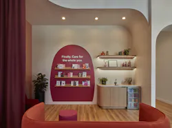
Stepping into the new Culver City, Calif., clinic, one is greeted by luxury vinyl plank flooring, decorative lighting, curved wall and ceiling elements, and warm hues of pink, salmon, and plum in the reception and lobby areas. The reception desk is a curved, solid surface, black piece with specks of white. Two walls flank the desk, a pinkish-red wall and a light grey wall with simple white floral elements. Here, a lowercase tia logo with its pink dot conveys an approachable, down-to-earth feeling.
“I don’t care what anybody says: the doctor’s office doesn’t have to feel like and look like it usually does! Even when I arrive in a great mood, the sterile, procedural environment is incredibly off-putting for me,” wrote blogger Cady Hakim in My Subscription Addiction. “This is not the case with Tia at all. As soon as I walk into the Culver City Clinic, I feel at home.”
The living room/waiting area is designed with soft white with pink undertone walls, hot pink accents, and dramatic plum-colored curtains for an additional pop of color, describes Swoyer. A merlot-colored, curved accent wall displays Tia literature.
“Tia’s design team and CEO aimed to eliminate sharp edges, both figuratively in their patients’ healthcare journeys and physically in their spaces, by incorporating curves as a unique and distinctive feature in the clinic’s architecture and millwork,” Swoyer explained.
“Accessibility to healthcare is core to Tia’s mission, and the spaces need to reflect that by eliminating any harsh, confusing, or impersonal elements from the typical clinic experience.”
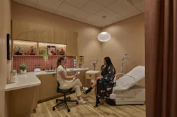
Inside the consult rooms, these spaces are decorated with terracotta orange walls, rust-colored privacy curtains, decorative lighting, plants, artwork, and warm wood cabinetry.
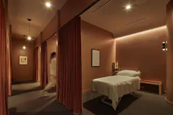
Continuing deeper into the space, the warm color décor continues and the lights are dimmed, creating a relaxing mood inside the wellness room for acupuncture and massage. Here, a rich, red clay color and a matching privacy curtain decorate the interior.
Additional spaces include the restrooms, tiled in bold black and white patterning, a clinical workspace, phone rooms, a Zoom room, and a break room.
IA Architects designed the private staff pantry as a place to grab a bite, as a hub for personal belongings, and as a comfortable space for practitioners to refresh between appointments. In addition, a discreet staff door at the back of the building allows for private entry and exit, separate from the client entrance.
A special feature in the break room, and living room/reception area as well, is the preservation of an existing skylight and natural wood. The heavy timber bow trusses and a wooden barrel roof with skylights added character at relatively low cost, the wood brings warmth, and the skylight provides ample natural light deep within the space, according to Swoyer.
“This created a unique, sun-filled spot for providers to enjoy and rest,” he related.
Moving forward, Tia seeks to improve its design in every new clinic.
“Updates may include material specifications, light fixtures, and placement of clinic elements, even as simple as the placement of a soap dispenser. Tia is very collaborative and has pulled IA into open discussions about what is working well and advice on how to improve in real-time,” Swoyer concluded.
About the Author
Barbara Horwitz-Bennett
Contributing Editor
Barbara Horwitz-Bennett has been covering the AEC industry for the past 25 years. She writes for a number of industry magazines and works with AEC firms and product manufacturers on content writing projects.

