Poor ventilation, water leaks, accessibility issues, and struggles with accreditation are behind the new design for New Fairfield High School in New Fairfield, Connecticut. The district solicited JCJ Architecture to redesign and replace the 1970s-era structure that was deemed by the town to have exceeded its useful life. The new building offered an opportunity to emphasize the school’s culture and integrate a neighborhood learning model.
New Fairfield High School, located at 54 Gillotti Road, was previously set back from the roadway and was connected to the middle school, sharing significant core spaces. The new 146,000 sq. ft. high school is situated closer to the road and was built adjacent to the existing building. The project cost $84 million and was completed ahead of the 2023–24 academic year.
Site Access and Dynamic Commons
JCJ Architecture approached the high school renovation project with three guiding principles: build community, foster collaboration, and put learning on display. JCJ associate principal Emily Czarnecki said the floorplan sought to integrate the various career pathways.
“Part of the inspiration was the integration of the academics with the Career Technical Education and visual and performing arts,” she said. “It was very segregated in the old building. In this building, those spaces became integrated and visible as you walk through.”
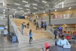
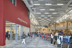
A challenge was to design a building that maximized taxpayer dollars and stayed within the budget. Associate principal Jeff Elliott shared how the three-story classroom wing configuration supported a multifunctional space scheme optimized for staff and students. The commons area serves as a student dining facility and a learning commons, with a central staircase that links the various floors. It serves as a gathering place, an extension of the dining area, and spectator seating for robotics competitions.
“The new building is designed around a commons area, which is a multistory and multifunctional space,” Elliott said. “How you start to build some of these adjacencies are the building blocks of the school, so you get multifunction and dynamic connections and activities throughout the day.”
JCJ Architecture had to address a significant grade change across the new high school site. However, the grade allowed the team to design three stories with accessible entry points at the main entry to the middle level from the plaza and a secondary entry at the lower level.
The middle school—constructed in the 1990s—would remain in place, while the high school would be reconstructed and relocated. The middle school is set atop a hill whereas the proposed high school location is on the hill.
“We proposed to situate the high school closer to the middle school so the main entries of the two buildings would dialogue across a community outdoor courtyard,” Elliott said. “It came back to joint use. The middle school liked to use the high school amenities because they don’t have an auditorium, and some of the robotics labs access elevates the middle school program.”
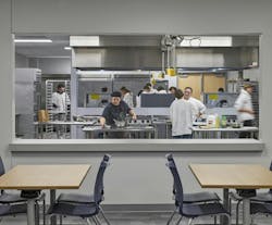
The school’s floor plan meshes spaces so students can utilize resources that support cross-disciplinary collaboration. The carpentry and construction classrooms are adjacent to the stage with overhead doors, making set construction and assembly easier. The culinary arts program fronts the dining commons so students can serve the community during events. Some of the classrooms and the wellness and fitness room overlook the gym.
The main entries are designed for bus drop-off and visitor parking. Adjacent to the parking lot is the lower-level entry for after-hours access by the community. Two circulation paths bring visitors, staff, and students into the learning commons, which serves as the unified core of the building across the two entry levels. The vertically shared space allows access to the auditorium, gym, and event center. A pedestrian plaza connects the two buildings to allow middle-school students and staff access to these valuable resources.
After the new facility was completed, the existing classroom wing and auditorium were demolished, while the original gymnasium and natatorium remained.
Three driveways offer site access. The easternmost driveway remained in place, the westernmost driveway shifted to improve sight lines and has expanded to a full-movement driveway, and the east has a new exit-only drive. The design team sought to improve vehicular access, circulation, and pedestrian safety through new traffic patterns.
“Part of the entry road was looping around so the high school and middle school were further back,” Elliott said. “But the new high school location brought it closer to the road so there was a visible connection back to the community. That’s where the community entry is now more visible, and there’s some wayfinding, making it easier for the community to engage.”
Timeless Colors
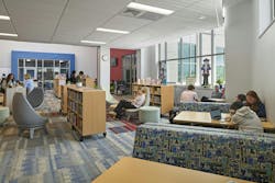
The New Fairfield High School Rebels’ school colors are red, white, and blue. JCJ Architecture integrated the hues in a timeless strategy, selecting areas for pops of subtle color, Czarnecki said. The library has two accent walls in red and blue and the walls around the entrances to the academic core spaces are colored.
The central learning commons space features an exposed ceiling with baffles to highlight the stairs as well as decorative lighting, since the space also functions as a community space. The exposed ceiling was a cost-saving measure.
Inside the robotics and engineering labs are metal perforated ceilings with patterns underscoring the high-tech program. The remainder of the school’s ceiling is a standard 2-ft-by-4-ft lay-in with linear scoring to create a contemporary vibe.
Other color considerations for flooring took a timeless approach with simple patterns. LVT floor tile in a neutral color pattern is used throughout most of the building because of its durability. The gym is fitted with hardwood and the Learning Commons has carpet tile.
Skylights illuminate the corridors while daylight and large windows allow natural light into classrooms and gathering spaces.
Flexible Furnishing
The learning commons offers glimpses into classroom activities and a space where students and staff can engage before, during, and after school as well as with the community. What makes each space effective is the thoughtful selection of furniture that meets everyone’s needs within the learning environment.
“Your space is only as good as you can reorganize and shape it,” Czarnecki said. “The furniture can also create that multipurpose adjustment and adaptability as programs change.”
Select faculty attended the EDSpaces conference with the JCJ Architecture team before setting up three trial classrooms with furniture and seeking feedback ahead of final selections. Staff completed a workshop to explore the flexibility of the furniture and can reference how-to posters for inspiration on desk arrangements.
The dynamic gathering, collaboration, and study spaces feature various seating types, desks, and tables that adjust for multifunctionality. Czarnecki said her team worked to balance collaboration and heads-down spaces, acknowledging the test requirements within schools.
“The desks can be pulled apart; when you need to have students do a test and you don’t want them on top of each other, that is important,” Czarnecki said. “That links to the adaptability and flexibility for the different needs.”
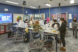
Classrooms have four seating types—chairs, stools, wobble stools, and soft seating—for students to choose how they learn best.
“When you think about students focusing on what they’re working on, they need to be comfortable and that’s going to be different for every kid,” Czarnecki said. “We heard a lot that kids love to be at high tops, feeling like they’re older and in a café or higher education facility. The soft seating that flexes can give them that little bit of motion to focus.”
Engineering classrooms have adaptable, movable furniture that can float between classrooms and shift to meet educational needs. Still, the classrooms retain the necessities of sinks, power, and writable walls.
Corridor space expands the learning environment beyond the classroom. Breakout corridors feature modular furniture where students can work in groups on projects. Each breakout space was designed with the nearby career academies in mind. The corridor by the art and Mac lab has big tables for projects, whereas the more academic spaces feature soft seating with writable surfaces and smaller huddle setups for group studies.
A lesson learned from the project was to move away from built-in storage within classrooms and choose flexible storage, especially in educational settings where multiple faculty members utilize a classroom. New Fairfield staff have a faculty workroom.
“If you can maximize your space and maximize your square footage, you can enhance some of the other areas well,” Czarnecki said.
About the Author
Lauren Brant
Staff Writer, interiors+sources and BUILDINGS
Lauren Brant is Staff Writer for both interiors+sources and BUILDINGS. She is an award-winning editor and reporter whose work has appeared in daily and weekly newspapers. In 2020, the weekly newspaper won the Rhoades Family Weekly Print Sweepstakes—the division winner across the state's weekly newspapers. Lauren was also awarded the top feature photo across Class A papers. She holds a B.A. in journalism and media communications from Colorado State University-Fort Collins and a M.S. in organizational management from Chadron State College.
