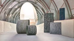
How Transit Maps Inspired Mohawk Group’s New Carpet Collection Smart City
When developing Smart City—a 12- by 36-inch Living Product-certified carpet plank system—Mohawk Group creatives were inspired by two questions: How have cities evolved? And what does that mean to us?
The new carpet collection reinterprets the transit maps of major cities into soft surfaces for commercial interiors. The collection includes Urban Model, which reflects the texture and rhythm of a metropolitan map, and Urban Mobility, inspired by the subway systems of Berlin, Istanbul, London, New York, Paris and Shanghai.
“The background effect really is a street map,” says Mark Page, senior director of creative design and development for Mohawk Group. “[Smart City] looks very textural on its own. It creates a very beautiful visual, and the rail network on top chopped up really looks contemporary. So, it's not as obvious when you walk into a place [with Smart City] that you're walking over a street map. It creates a very modern, contemporary feel with a great story behind it.”
See more of Smart City on Inspire.
For Smart City, Mohawk Group collaborated with global design and architecture firm Gensler. The carpet collection’s design and development followed the Gensler Cities Climate Challenge (GC3) and the AIA 2030 Commitment, which are initiatives that call for all new buildings and major renovations to be carbon neutral by 2030.
Smart City comes in Mohawk Group’s standard Heathered Hues yarn system, a sustainable, solution-dyed nylon fiber that requires no water for production. “It gives the fiber a little bit more of a wooly, textural feel,” Page explains.
Urban Mobility pictured here in blue with the tube system of London. “We’ve gone to Asia, Australia, Europe and really took that color palette of gray tones around to make sure that it got universal blessing—and then color wise, we introduced the blue which is really one of the more common colors that are selling in the commercial environment,” says Mark Page, senior director of creative design and development for Mohawk Group.
Last year, Mohawk Group launched Duracolor Tricore—one of the Heathered Hues that Smart City is available in—which features a hollow core and is designed to repel stains. “From an environmental stance, it means with just hot water extraction, you can get most spills out of the product without introducing new chemicals into the environment,” Page says.
Smart City also meets the requirements for the Living Product Challenge, which requires products to have a net-positive impact on resources, the community and the environment.
Along with the collection’s sustainability, Page says personalization has also been a big draw for clients, including one in Houston and another in Chicago.
“In Houston, rather than a rail system, we looked at bike paths,” he explains. “They’ve got the city map and then bike paths laid up at the top. It allows the community and the people that work in that community to connect with a more healthy transportation system and something that’s unique to the area they live in…That [personalization] has really taken off, and that will continue to take off globally.”
And global has become a key buzz word for Smart City—not just in its inspiration from diverse city planning from anywhere from Istanbul to New York City, but in net positivity and putting out a product that adds value to markets around the world.
“At the end of the day, it's not just a commodity item that we're providing to any environment—it’s product that actually has something else of interest,” Page says. “And whether you know the story or not, it’s great for any owner or interior designer to learn about the story and to be able to talk through it as people come through.”
More Product Innovations 2020:
