Merging the Traditional with the Unexpected Enlivens Boston Design Projects
Now in her eleventh year with RODE Architects—a firm based in Boston’s bustling South End—principal and interior design director Jessica Haley draws on the culture and architecture of the foundational New England city for inspiration. Her prime objective is to infuse projects with a sense of homecoming, comfort, and approachable luxury, with an eye toward utilizing lessons gained from hospitality settings across the spectrum of RODE’s client list.
i+s: You have an educational history with Boston prior to working with RODE—having earned degrees from The New England School of Art and Design at Suffolk University and Boston Architectural College—and you’ve worked on many projects in the greater Boston area. How do local history and contemporary culture inform and inspire your design decisions?
Jessica Haley: My answer would have been different 10 years ago. Boston is starting to change—I think for the good. Specifically, hospitality projects that I was working on years ago were very neighborhood focused; you had to ensure that you were really knitting the location into the established architectural language. A lot of businesses were more saturated within the historical settings, like the Back Bay, South End, Financial District, and downtown. They already have this design language; you need to be able to react to it and you can’t ignore it.
We are good at holding onto that traditional Boston feel while layering on concept-driven design. With Boston expanding out, with the Seaport district and a whole new neighborhood, that offers more of a blank canvas.
So now we’re seeing a bit more response to design innovation that I don’t think we ever saw before; oftentimes it was constrained, a little more conservative. It allows us to have more variety in our work. We’re looking to try something new on every project.
i+s: Speaking of that embedded history in different neighborhoods: Is that an obstacle, an inspiration, or both?
JH: It’s a little of both! Sometimes it can be hard when you don’t have that established vibe to build from. In newer buildings, for example, where they’ve never been built out as a retail space, you have nothing to grasp onto. You’re creating this whole thing from scratch.
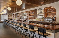
For one client—a hospitality group—I did a project eight or nine years ago in the South End, with a Venetian-style concept. One of the first things we talked about was that we’re bringing Venice to the South End, but we needed to make sure that it was knitted into the fabric of the South End. We embraced the building — that brownstone feel with exposed brick walls and reclaimed wood floors, low ceilings. Then we were bringing a lot of inspiration in from Venice streetscapes and putting that on top of it. You got the best of both worlds, where you walked by and you felt like it was this neighborhood spot. But then you’re drawn in by interesting details that are inspired by the streets and bacaros in Venice.
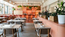
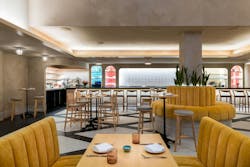
We just finished a new restaurant project for the same client. It’s further out in the Ink Block neighborhood. That’s an all-new development of condo buildings, with retail and restaurants nearby. The client said, “I don’t want this to look like my other restaurant.” And I said, “Oh, it’s not going to.” The fabric of this side of the South End versus where SRV [Serene Republic of Venice] is located is completely different. [This restaurant] has 25-foot ceilings and an all-glass front. They don’t look anything alike because we were able to concept something that Boston had never seen before. The business is vibrant and they’re so busy because people are excited to see something new.
That’s what I mean: It’s exciting to see the progression of Boston breaking away from some of the traditional architecture. It’s both good and restricting to have that [tradition].
i+s: RODE Architects works on many hospitality projects, from quick-serve restaurants to fine dining and hotel spaces. What are some challenges you encounter in these projects?
JH: Hospitality venues sell three things: Food, drink, and ambiance. There’s a lot of pressure on the design of the space; that’s why I have found them to be my favorite typology, although we are involved with others such as multifamily, work, and institutional projects. But hospitality is where you can be truly creative, because people want that as part of their brand.
Challenge wise, there’s so much pressure on the final product and making sure that it speaks to the client’s vision, the food they’re serving, and the type of service their customers look for — even how loud to play the music… What does it feel like to be in the space from a reverberation standpoint? All of those things matter to the dining experience.
Pressure is one thing; then there are budget constraints when it comes to most hospitality projects. A lot of our clients are first-, second-, or third-generation projects. Often we walk them through the interior design process for the first time. They’ve never worked with an artist, or an architect and designer, so there is some education involved.
At the end of the interior design phase, there is compromise because budget comes into play and you have to do some value engineering. The greatest challenge is expectation management. In that moment, the client’s quick response might be to value engineer things that they don’t realize can change the impact or impression the design leaves. And as designers, we have to say, “If you do that, we all need to understand what we’re compromising” and make sure that’s communicated very clearly.
On top of that, the durability of these spaces has to be top notch. You need to balance durability with comfort and the personality of the space. People are very tactile these days. They want softness, but every material that’s a little softer is a little less durable. Again, you’re striking a balance and setting expectations. We rely heavily on the art of communication, making sure that everybody’s comfortable with the direction things are going and feeling confident that the end result is going to be what they expected — or exceed that expectation!
i+s: Materiality is important. Do you find it difficult to accommodate more sustainable materials, or are the products that you’re seeing on the market addressing sustainability aspects alongside durability?
JH: The industry on the whole has become very conscious when it comes to incorporating sustainability into their goods. We feel pretty confident for the most part that any contract-grade material is going to have a “green” story to it, but at varying levels. We strive to be as mindful as possible when it comes to choosing materials that have a good sustainability story. The interesting thing is that if you’re selecting a material or furnishing that’s not durable and it has to be replaced in three years—that is not sustainable. So we discuss that as well.
Furniture is an area of concern. We encourage our clients to spend the right amount of money up front to make sure that they’re purchasing chairs and tables that are going to last, because I could see that getting replaced constantly. People don’t want to spend a lot of money up front. They don’t want to spend $600 per chair; they want to spend $200 on the chair. But if you spend wisely, you’re not going to be replacing your chairs every two years.
Upholstery is also something that gets a lot of wear and tear, but the major manufacturers have gotten really good about providing options in terms of comfort, softness, durability,. and sustainability. We’re finding more options that check all of those boxes that we need—easy cleanability, not requiring a lot of chemicals. We walk through the care requirements for everything that’s installed and oftentimes it’s very basic maintenance.
Other sustainability impacts are things like mechanical systems such as HVAC. There are big interior design choices that can add up when it comes to energy use—adding vestibules, or if you can’t have a vestibule because of space, making sure you have an air curtain. These will help in the long run with the operating costs. We try to ensure we’re environmentally conscious from different angles.
i+s: Are there specific lessons, design elements, or even customer requests from hospitality projects that you’ve been able to apply to other project types?
JH: Since I’ve been in charge of our interiors department at RODE, I started building upon the hospitality work. I developed our design process through those projects—the way that we build our concepts up and a back story. That leads to the mood boards and the material palettes, then the final product. That process is now used on every type of interiors project here at our firm.
If we’re designing a multifamily project, or a workplace project, those two specifically require a similar hospitality approach to design these days. We’ve learned that in all of our different sectors, people want rich spaces. Our developer clients want the amenities spaces and the lobbies to feel hospitable, like high-end hotels! Post-pandemic, it is so hard to get people back in the office that many major companies are essentially creating resorts to attract their employees back.
What I’ve learned from our hospitality clients and the way that they think about their spaces is how our whole design group now works in any sector. It’s what we promote and talk about when we’re meeting with prospective clients, explaining that approach and mindset of comfort, ambiance, and quality from the beginning. And we’re going to take you through a truly creative process to get to the end result, because every space needs to be welcoming and hospitable.
i+s: I could see that. And I anticipate that extends to considering the plan for a restaurant or a hotel lobby; you want people to understand where they are as soon as they walk in.
JH: Yes, our multifamily and developer clients learn a lot about branding — more so than ever before. New buildings that are going up, they’re not just an address anymore. It’s a brand, it has a name [like the Ink Block]. Branding and interior design work hand in hand to create a very rich sense of place and purpose to these buildings. The goal is to be memorable.
Hot takes with Jessica Haley
Biggest design pet peeve: This is an unpopular opinion—murals that I’ve seen a million times in restaurants. I feel like we could get a little bit more creative; let’s move past it.
Favorite part of the design process: Translating the client’s vision. They always come on board with some sort of idea, whether it is the cuisine, or taking the things that are rattling around in their head and then turning that into an interesting visual concept. There’s an appreciation that comes from being able to listen carefully and translate the ideas into something that feels cohesive and clean for the initial concept presentation.
Unusual event(s) or unexpected finds during a project: We had a multifamily project that was replacing an area of the city that used to house mechanic shops; it was almost a parking lot then. When the demo crew got there, they found a newborn litter of kittens, so we brought them to the SPCA. So that was a good thing.
There’s always talk about Boston having crazy existing conditions. Early on, we were redoing a space. We did all the existing measurements ourselves because we were young, and halfway through the project, we realized there was not a straight wall in this place.
All of our drawings are showing straight walls. So we had to go back so many times and retake measurements, readjust the design and furniture plans because we found that things would not fit in certain spots. It was certainly eye opening!
That project was also interesting because we took down a ceiling and found beautiful, deep coffered, original ceilings underneath it, which caused us to change our design in that area. Boston is intriguing; when you start to peel away the layers, you don’t know what you’re going to find, good or bad.
*The conversation has been lightly edited for length and clarity.
About the Author
Carrie Meadows
Head of Content
Carrie Meadows is Head of Content for interiors+sources, where she leads editorial strategy, content development, and brand storytelling focused on the people, projects, and innovations shaping the design industry. With more than two decades of experience in B2B media, she has built a career connecting technical expertise with creative insight—translating complex topics into meaningful stories for professional audiences.
Before joining interiors+sources in 2024, Carrie served as Editor-in-Chief of LEDs Magazine within Endeavor Business Media’s Digital Infrastructure & Lighting Group, guiding coverage of emerging lighting technologies, sustainability, and human-centric design. Her earlier editorial experience spans across Laser Focus World, Vision Systems Design, Lightwave, and CleanRooms, where she managed print and digital publications serving the optics, photonics, and semiconductor sectors.
An advocate for clear communication and thoughtful storytelling, Carrie combines her editorial management, SEO, and content strategy expertise to help brands and readers stay informed in a rapidly evolving media landscape. When she’s not crafting content, Carrie can be found volunteering at a local animal shelter, diving into a good crime novel, or spending time outdoors with family, friends, and her favorite four-legged friends.


