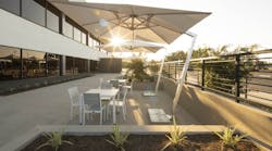
“People love to be outside,” says Kate Macaulay, project manager at The Architectural Team Inc. It’s a sentiment designers must take into account. If given the opportunity, tenants will utilize exterior spaces—and they’ll appreciate them as amenities.
When working on a renovation for NextCorps’ headquarters in Rochester, NY, Macaulay activated the rooftop as a tenant-accessible terrace space. It’s now recognized as a strategy that worked very well for the company. When working to renovate or update your building, consider how you can include outdoor spaces in any designs.
Whether it’s activating a rooftop or adding seating to a portico, outdoor spaces are “an inviting place for the greater community to spend time and recharge,” says Louise Sharp, principal for HLW’s Los Angeles office.
When it comes to materials and furnishings for the outdoors, she adds that durability and performance should be considered just as highly as aesthetics.
But if staying within a tight budget is a concern, focus on areas that provide plenty of natural daylight and good views. This can counterbalance more modest finishes, equipment and furniture, according to MB Real Estate.
Check out how these buildings activated their outdoor spaces:
Terrace at 915 Wilshire
Architecture and design firm HLW wanted to celebrate 915 Wilshire’s renovated lobby as a piece of art, so they relocated all seating to the new outdoor portico, keeping the inside exclusively for circulation. But the HLW team created fluidity by using the same material for both spaces.
At the 22-story office tower in downtown Los Angeles, the terrace on the seventh floor is also meant to emphasize the relationship between indoors and outdoors, as well as the views from the rooftop.
The main focal point is an 8-foot tree located in the center of the space.
[Related: 4 Office Must-Haves for Employee Wellness]
Sleep Number Corporate Headquarters
An outdoor roof terrace was added to an existing roof adjacent to the workspace at Sleep Number’s corporate headquarters. With its views of downtown Minneapolis, it has become another place to work and socialize during warm weather.
Ware Malcomb Katella Office Campus
Ware Malcomb recently designed the new exterior architecture for the front entry of the Katella Office Campus, located on the border of Orange County and Los Angeles.
[Related: Outdoor Design: Top 4 Trends]
The firm also provided site upgrades to the shared break patios behind the buildings, including new paving, landscaping and added seating.
Ghost Cabin, Chophouse Row in Seattle
When contractors began working on Chophouse Row in 2013, they discovered that buried several feet below the eclectic mix of historical buildings was the foundation of a small house—the remnants of a pioneer settlement dating back to the late 19th century.
SHED Architecture and Design was chosen to design an art piece for the courtyard space above the site to honor the historic discovery.
To produce the art piece in the courtyard, SHED projected the silhouette of a gable cabin onto the various surfaces of the courtyard corner, then applied cedar wood planks within the artwork boundary.
When visitors move through the space, the angled outline of the structure becomes increasingly distorted and unrecognizable.
Connecting your building to the outdoors is the important part. Tenants often need respites from their interior offices, as well as interesting places to meet, mingle and relax. The right outdoor space can be a big draw to your building for both tenants and the talent they’re looking to hire.
Simply put by Macaulay, people love to be outside. Help get them there.
Read this next: Designing for Wellness in the Workplace
