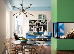
Welcome to the Dark Side
Perhaps it’s the volatile political climate that seems to be erupting every time the news is on. Or maybe the color experts are picking up on a sense of contemplation in the air. Whatever the case, the color trends for 2018 are darker than in years past. But that’s not to say there aren’t plenty of vivid hues to balance things out and reflect a sense of optimism in the year ahead as well. Judging by the choices of varying shades of black as color of the year by forecasters, and gray making a strong appearance in upcoming color palettes, it’s safe to say the coming months will lean toward “the dark side” of the spectrum.
The move toward deeper, saturated hues isn’t necessarily new, however. Last year, Benjamin Moore selected a rich, royal amethyst called “Shadow” as its color of the year for 2017. This striking tone is equally “sophisticated, provocative, and poetic,” according to Ellen O’Neill, creative director for Benjamin Moore, and “can bring energy to a space or harmony and a moment of respite.”
At NeoCon this past June, PPG Paints announced its 2018 Color of the Year is “Black Flame,” a statement-making black infused with an undertone of the deepest indigo that evokes the privacy, hope, and classic modernism that many consumers crave today.
“Black Flame is already prominently appearing on a variety of surfaces and materials,” said Ruthanne Hanlon, PPG national color and design manager. “Variations of black are being embraced by designers and consumers for its bold, dramatic look that is both edgy and sophisticated, yet traditional and classic.” She noted that black is becoming the go-to color for windows and doors, as well as in stainless appliances, in part because “millennials crave a different aesthetic than what their parents had. As a nod to the glamour of the Art Deco era, we’re [also] seeing black combined with gold or brass on furnishings, light fixtures, and accessories.”
Similarly, the “no-fuss” shade of black dubbed “Deep Onyx” is GLIDDEN’s top color choice for 2018. Going back to basics with “the most forgotten neutral,” Misty Yeomans, color marketing manager for GLIDDEN, said black “is actually one of the easiest colors to use to create the low-key, easygoing style that’s trending for 2018.”
Sherwin-Williams’ 2018 Colormix Forecast, on the other hand, doesn’t highlight black but features plenty of tones infused with gray in its trending Sincerity palette (one of three for 2018), which is inspired by minimalism and daily meditation. “Sincerity is about mindful living and creating an environment to disconnect and recharge,” said Sue Wadden, director of color marketing for Sherwin-Williams.
Likewise, the move toward a balanced neutral that’s rooted in gray is also seen in Evolve, the Color Marketing Group’s (CMG) choice for its 2018+ North American Key Color. Imbuing a contemplative mood in the forecast palette, the continuing importance of gray will be seen across the spectrum of commercial spaces, according to the CMG.
“Textiles, and hard and soft surfaces, will carry the hue forward as both primary and background color,” the CMG noted in a press release. “When effects such as high-gloss or metallics are added, it attains a technological edge, adding warmth to our handheld devices, cars and bikes, and small appliances.”
Pops of Color in Interiors and Products
Before things get too gloomy, there’s a much brighter side to the color story next year. Sherwin-Williams’ Colormix Forecast also calls for plenty of vivid colors that draw from emerging global trends and offer new perspectives on societal influences. Its Affinity palette is inspired by bright folklore, told in memorable pops of peacock colors, animated fuchsia, and grounded brown; while the high-tech Connectivity palette serves up colors people crave: pixelated orange, violets, digital greens, and high-def yellow.
Color experts predict these trends—both dark and bright—will emerge across a variety of markets and product applications, from hip corporate offices and energetic hospitality environments to more focused education spaces and healing healthcare settings.
“While black was once reserved for ceilings in retail spaces and restaurants, this hue has now moved to walls, flooring and textiles, making it featured and celebrated in a way that makes a statement and creates focus, character, and atmosphere,” Hanlon explained.
Likewise, Wadden said global influences, including the need for minimalism, the celebration of indigenous patterns, and the movement toward the high-tech, will play out across a variety of interior elements and markets. “We expect these color trends to seep into all interior aspects of design including furniture, painted walls, textiles, and more.”
Emily Kantz, interior designer, color marketing and design at Sherwin-Williams, predicts that the trend toward deeper, darker jewel tones that help create dramatic, moody spaces will be most prevalent in the hospitality market. In contrast, “corporate markets are getting bolder with some of their interior colors choices,” she explained, adding that “a bold splash of color is often a great branding tool to use throughout the space or bring a youthful pop to an office space.” Kantz also said brighter colors, such as Exuberant Pink, Jay Blue, and Organic Green, will resonate with a younger generation in the education market that’s influenced by the connectivity and energy that technology affords.
For healthcare, Kantz noted designers can utilize some of the trending colors—particularly in public zones such as lobbies, corridors, children’s areas, and cafeterias—“because the institutional look is out, people want colors, and they also want tones that remind them of nature.” She added that blue will always be relevant because it promotes heling, but citrus-inspired hues are coming into play, as well as greens and yellows paired with wood.
While the forecast calls for deeper and darker shades, it also means the bold, brighter colors will stand out all the more—and that’s the silver lining for 2018.
