New Company Headquarters Blends Open Office and Home Design
As online food delivery companies such as Grubhub and DoorDash in the U.S. are increasing in popularity and giving people on-demand access to goods and services in-home, the same is true abroad — and the impact can be clearly seen in the design of these burgeoning companies’ corporate offices. Case in point: the Turkish online food deliverer Yemeksepeti recently completed its nearly 100,000-square-foot, dynamic new headquarters in Istanbul, which embodies the 24/7 lifestyle of its customers that served as the driving concept behind the project.
♦ When Product Design + Architecture Collide
Meeting the needs of a diverse, energetic group of employees that work at all hours isn’t always easy, but the design team at Erginoğlu & Çalışlar Architects (ECA) created a flexible, yet striking, workplace in which employees can roll up their sleeves, find a comfortable place to socialize or even take a nap.
“It is always a challenge to design an office space that meets [every] goal because different people with different backgrounds and different work habits share a vast space,” said Necmi Çiran, corporate communications specialist at Koleksiyon, one of the key furniture suppliers on the Yemeksepeti Park project that worked directly with the design team at ECA. “In this case, the project is nearly 10,000 square meters, and it consisted of different sized co-working spaces — which required new geometries — meeting rooms, lounges, shared offices, communal areas and private areas.”
Yemeksepeti Corporate Headquarters Space Broken Down
To that end, each of the building’s five floors was designed around the needs of each department, and as a whole, expresses their differences through the use of colors, themes and ideas. Each floor is characterized by a color scheme derived from the company’s logo, starting with a bold, red tone and transitioning to a brighter, yellow hue.
Upon entering the 5-foot atrium, visitors have clear views of themed catwalks with unique colors and names that connect the floors to sleeping areas throughout the building where employees are encouraged to stay refreshed. A studio and meeting rooms designed around a “small-shop” concept are located on the main floor along with a large diner-inspired cafeteria that includes leisure activities such as table tennis.
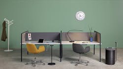
The sales and business development departments are located on the first floor clad in red, where various capsule-shaped spaces have been placed to serve as meeting rooms and directors’ offices. The remainder of the open-office concept features workstations that seat 10 to 18 employees, as well as a relaxed, circular lounge space.
The predominant feature of the second floor is an enormous serpentine table, which extends from the center of the floor plate to its west wing, accented by a custom suspended lighting fixture that mimics the table’s shape. The east wing features a café and lounge that are adorned with amorphous and geometric shapes and bright colors.
With the IT department located on the orange-colored third level, management offices and speed-meeting areas required workspaces that maximize efficiency. The fourth floor is defined by hexagonal shapes and a yellow-orange mid tone, where open office workstations are supported with honeycomb lighting and carpets that repeat the geometric pattern. Hammocks in the “Cloud” zone (aptly named for accompanying cloud-shaped lighting fixtures overhead) define relaxation areas where employees can recharge.
Finally, a massive cutout between the fourth and fifth floors accommodates large, stadium seating that serves as a gathering point for meetings, movies or other events. A second, smaller opening between the floors features a large hammock adjacent to a two-story bookcase for a relaxing and inspiring social area.
How Koleksiyon Delivered with Rothko Desking
interiors+sources recently connected with Çiran at Koleksiyon to find out how the manufacturer worked with the design team to meet the project’s challenges using its Rothko desking solution, specifically:
i+s: What were a few of the challenges encountered during the project, and what design solutions were employed?
Necmi Çiran: Some geometries were challenging [but] our Rothko product enabled us to try new geometries and be free so that we felt whatever the architect draws on the plan, we will be able to realize it, because it is exactly what this desk system enables us to do.
The loop table on the second floor was especially challenging, but our system enabled us to execute it perfectly. Also, the architectural design team wanted to create a flowing space which resulted in circular geometries, so we used our circular soft seating products along with our Rothko desk system, which basically uses a special desk panel that is cut into the required shape and fits the standard or designed leg system.
i+s: What were the requirements for the furniture selection, and how did the team decide on Koleksiyon’s Rothko table?
NC: The basic idea was to create a refined, transparent and home-like aura in the work environment that was not a typical work benching solution with symmetrical layout solutions. The client saw Rothko as a unique offer in this sense with its atypical application possibilities of rich layout options with non-orthogonal formations of the work surfaces.
i+s: Tell us more about the features of the Rothko table and how it functions within the space.
NC: Rothko is a desk system with an open language, which invites the architect or planner to design and compose their unique forms and set ups. Thanks to the design of a desktop with no need of a frame under, the work tops can take any shape and be composed in any proportion that’s needed for each specific customer and their needs.
i+s: How does the Rothko product fit within the design language of the project?
NC: The project aimed to create an open and social habitat that encouraged not only active participation of all employees with enthusiasm, but also provide bays of solitude for private retreats which are areas for focused work. Rothko had a unique quality to merge these opposing situations under the coherent design language of a single program.
About the Author

Robert Nieminen
Market Content Director
Market Content Director, American School & University, Architectural Products, BUILDINGS, and interiors+sources
Robert Nieminen is the Market Content Director of four leading B2B publications serving the commercial architecture and design industries: American School & University, Architectural Products, BUILDINGS, and interiors+sources. With a career rooted in editorial excellence and a passion for storytelling, Robert oversees a diverse content portfolio that spans award-winning feature articles, strategic podcast programming, and digital media initiatives aimed at empowering design professionals, facility managers, and commercial building stakeholders.
He is the host of the I Hear Design podcast and curates the Smart Buildings Technology Report, bringing thought leadership to the forefront of innovation in built environments. Robert leads editorial and creative direction for multiple industry award programs—including the Elev8 Design Awards and Product Innovation Awards—and is a recognized voice in sustainability, smart technology integration, and forward-thinking design.
Robert's work has earned him industry-wide recognition throughout his career, including:
- ASBPE Award (2019, 2018, 2017, 2015)—Best Regularly-Contributed Column; retrofit
- TABPI Award (2017, 2016)—Top 25 Entries, Cover Story; Retail Environments
- WPA Maggie Award (2011, 2010, 2008)—Best Publication, Trade; interiors+sources
- FOLIO: Eddie Gold Award (2022, 2007)—Best Feature Article & Special Section; interiors+sources
- Contributing author of ASID’s 2020 Outlook and State of Interior Design report, as well as The State of the Interior Design Profession (Fairchild Books, 2010), which earned a place on the International Federation of Interior Architects/Designers’ “50 Must Read, Must Have” book list.