KitKat Opens First Permanent Store in North America
Stepping inside the first permanent North American KitKat store, one will easily notice all the subtle nods to the chocolate-covered wafer bar.
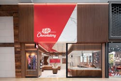
Located in Toronto, Canada, the KitKat Chocolatory, which debuted in November 2019, introduces a new retail look for the brand and offers a “chef’s table experience” for customers in the Yorkdale area and beyond. Its made-to-order overhead lighting (comprised of solid walnut and LED fixtures), custom-cut floor tiles and inlays, and vertical wood panels that line the bar and storefront all resemble KitKat candy bars.
“The use of custom-designed and fabricated items was very important to create a space that was unique,” says Justin Vinet, senior environmental designer for model/ctzn, the design firm that worked on the KitKat Chocolatory. “Our concept is a kitchen, maker’s studio look because that’s what the product is—you’re formulating your own KitKat chocolate bar. It was key to reflect that throughout the design with multiple elements.”
Customers who visit the shop will see their name and order on a custom train station-style flip board. They can then choose to customize their KitKat bars with a variety of toppings, including caramelized popcorn and rose petals, in a menu item cheekily called “Create Your Break.” There’s even a small Instagram booth for patrons to snap pictures and show off their creations.
[On Topic: Bringing Children's Library Design into 21st Century]
The 25-foot storefront outside features nostalgic signage and a metal wrapping that flows down and into the interior ceiling. Vinet says coordinating this element of the project was one of the biggest challenges. “Many trades, consultants and fabricators all had to be correctly coordinated to achieve a seamless storefront,” he says.
The goal of the project was to represent the KitKat brand in an innovative way, to incorporate subtle brand representations throughout the design and to create a functional space for high foot traffic.
“We feel we executed a successful product for the client and brand,” Vinet says. “It was really about the experience and creating a functional space where, when you walk in, you’re going to have fun—but it’s not a theme park. You’ll just feel the inspiration and enjoy your time there.”
Read Next: World's Largest Starbucks

