Biophilic Design Goes Beyond Plants
How does a metal recycling firm signal its ongoing commitment to sustainability? By asking architectural firm Hendrick to create a new office that’s rooted in biophilic principles. The headquarters exemplifies how to integrate biophilia into every facet of interior design.
“At its core, biophilia is about connecting people with nature,” explained Jennifer Treter, managing principal for Hendrick. “The Novelis project is based on three biophilic pillars: nature within the space, elements that suggest nature and qualities that encourage wellbeing.”
Client Vision
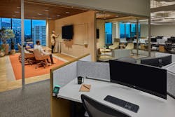
Novelis is already invested in the circular economy, so it was a logical move to extend this model into its new Atlanta headquarters. The space needed to be sustainable as well as egalitarian. The company wanted to remove hierarchical divisions and siloed offices. The new design embraces free address, even for the executive team.
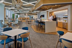
“Our mantra became ‘How do we earn the commute?’ Because if people can choose to work from anywhere, including the comforts of home, the office must offer value,” Treter stressed. “Biophilia softens the Novelis space so it has a comforting, familiar feel that encourages social interaction.”
While it might be expected for a recycling company to exude an industrial vibe, Hendrick took a different approach for Novelis. Warm and cohesive, biophilia is what unites the open concept across three floors. It’s used directly and subconsciously through greenery, wood, lighting and art.
1. Plants
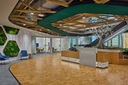
The lobby is flanked by a living moss wall placed inside a polygon frame, a shape that evokes the recycling symbol. Vertical planters along the glass facade and horizontal boxes between zones serve as lush dividers. Floor and tabletop containers are plentiful, all in neutral colors so the focus is on the foliage. Plant species are low maintenance, especially for water needs.
“Even the accents of forest green are a touch of biophilia. While part of the Novelis brand palette, they also add a rich contrast to the light wood,” said Stephen Wells, principal at Hendrick. “The lobby’s acoustic tile is even in the same emerald shade, pulling double duty for noise dampening while referencing trees.”
2. Wood
“The trellis system evokes the power of trees with overhead patterns and repetition. Low lighting creates shadows for an abstract interpretation of a tree canopy,” added Wells. “They’re strategically placed over gathering points, like the lobby and soft seating.”
The indoor pergola and recessed alcoves with booths are both examples of providing places of refuge as part of biophilia. “Refuge is illustrated by enclosure and sensory retreat using overhead canopies and vertical screening,” according to a GSA article titled Biophilic Design. These havens are another way to give employees choice as they shift through different task styles.
3. Light
“We also used artificial light intentionally. Daylight harvesting lowers energy consumption while circadian lights automatically brighten and dim to replicate the sun,” Wells explained. “Additionally, we selected ceiling lights that have an X shape to echo the lines in the wood trellis.”
4. Artistic Representation
The most direct embodiment of biophilia at Novelis is a life-sized aluminum tree that graces the lobby. It is paired with a kinetic sculpture that extends above into the staircase, which has metal cutouts of birds and leaves.
“The aluminum tree is an artistic statement that combines biophilia and branding,” Treter said. “Art is a meaningful way to tie nature into a space. Corporate identity doesn’t have to be an ad campaign—it can be balanced by organic cues.”
About the Author
Jennie Morton
A former i+s editor, Jennie Morton is a freelance writer specializing in commercial architecture, IoT and proptech.


