Nike’s New Serena Williams Building Wins LEED Platinum
There’s no question that Serena Williams is the Queen of the Court in the world of tennis, inspiring millions with her sheer talent and athleticism. It’s fitting, then, that Nike looked to capture Williams’ “phenom-warrior-muse” persona in the building of her namesake, home to the company’s innovative, new World Headquarters in Beaverton, Oregon.
Designed by Skylab Architecture, the 1 million-square-foot Serena Williams Building is the largest structure on the global sports brand’s campus that is estimated to be the size of 140 full-sized tennis courts—a fitting tribute to one of the biggest names in sports. The massive, LEED Platinum-certified building was built to accommodate a workforce of nearly 3,000. It simultaneously pays homage to Nike’s heritage while looking toward the future of work—and the planet.
The design team at Skylab Architecture designed all aspects of this programmatically complex building, including core and shell, interiors, FF&E and brand integration.
Empowering Connection and Collaboration
After decades on the Beaverton campus, Nike’s product designers companywide had become spread out across multiple buildings, which did not support a sense of cohesion, according to Susan Barnes, principal and director of architecture at Skylab. To remedy the situation, the building is organized so that designers for each brand occupy a single level, while the corresponding services stack vertically between levels. In a first for Nike, products can move from sketch to prototype to final design to retail fixture all under one roof.
“The idea from the beginning was to have all of the designers in one building so that there would be cross communication and visual connections between them,” she said.
As a result, Skylab placed the circulation and public rooms in the center of the building and created blocks of utility spaces extending out, such as a long, central bar of conference rooms broken up by open workspaces to help break down the scale. “That was definitely one of the challenges that we had,” Barnes said. “How do you make it feel human scale at such a large footprint and with distances to walk? So, wayfinding was definitely something we were constantly thinking of too.”
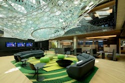
The 160-foot-long Design Connector, a rotational steel truss tube, spans between four levels of design and office space. Natural light floods the workspaces from glazing on two sides and skylights above the communicating stairs.
Inspired by Greatness
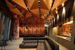
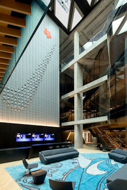
“They always refer to [Williams] as kind of this warrior and muse, and so the toughness of the exterior is in contrast to some of the softer, more colorful, flowing interiors,” Barnes explained. “And then obviously we had amazing resources to work from in terms of her history and career and personality” that inspired the custom artwork seen throughout the building.
In ancient Greek mythology, Nike is the winged goddess of victory. It’s fitting, then, that Serena Williams’ building has wings too—each of which is named after one of the three phases of her career.
[Related: Montreal’s Rosemont Community Center Welcomes a New LEED Gold Aquatics Building]
“The wings are called Phenom, Warrior and Muse, and so the color palettes were developed around that thinking and based on a lot of her iconic apparel that [Nike] designed for her,” Barnes said, noting that the design team referenced oranges and purples that were evocative of her early career, as well as iconic dresses Williams had worn. The tennis theme also carries through in the food service venues, named after several of the classic events such as the New York Open and Wimbledon, the rooftop restaurant.
‘Towering’ Amenities
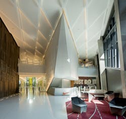
The building consists of four programmatic components: a merchandising center for prototype retail spaces; integrated design studios for multiple product categories; an underground parking garage and loading dock; and a 12-story tower with shared amenities for the whole campus. The tower combines two intertwined volumes, as a nod to the two founders of Nike, and serves as the first celebrated architectural element that can be seen beyond the low-lying campus that was previously hidden behind what they called “the berm.”
The tower “was really intended to be iconic to the whole Nike campus,” Barnes said. “We worked with them on the programming in such a way that the amenities could be used by anyone in any of the teams on campus.”
The 10th floor features a rooftop restaurant and bar with expansive views to Mt. Hood as well as a world-class lecture hall and multiuse space that can host parties or products displays, for example. Accessory spaces like atria, communicating stairs, modular kitchenettes and courtyards keep spaces at a human scale.
A Champion of Sustainability
The new Serena Williams Building was designed with environmental performance in mind. From the onset of the project, Barnes said the client determined LEED Platinum certification should be among its primary goals—and it succeeded, not surprisingly. The building achieved 82 out of 110 total possible points under the LEED v2 rating system and reached a number of notable benchmarks (see sidebar below).
LEED Summary
The Nike Serena Williams Building achieved 82 points out of 110 total possible LEED points. The most significant categories were Energy & Atmosphere and Sustainable Sites. The project earned all 6 Innovation in Design points, and 3 out of 4 Regional Priority credits.
Other sustainable elements include:
- Low flow plumbing fixtures and a rainwater reuse system for flush fixtures reduced indoor plumbing water usage by 69% compared to a baseline building.
- The building was installed with energy efficient mechanical and electrical systems that allowed for a 46% energy cost savings compared to the ASHRAE 90.1 2007 baseline.
- The project has recycled 77% by weight of the waste generated on-site over the course of construction, meeting the initial goal set at the project start.
- The project used building products with recycled content totaling 24% of the total cost of all materials.
- The project used 81% by cost of building materials or products from FSC-certified & sustainably sourced forest.
- All of the adhesives, sealants, paints, and coatings for the project are well below the allowable VOC thresholds.
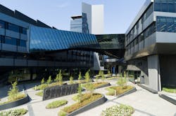
Each of the building’s distinct bars cascade to the south and feature inhabitable, interlacing green roof terraces that overlook the wetland. These terraces allow for outdoor workspaces and connection to nature even at the upper levels of the building. Energy efficient mechanical systems include displacement ventilation and radiant sails, and a 260 kW photovoltaic array screens rooftop mechanical units from view.
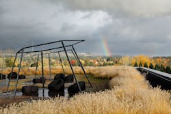
To maximize connection to the landscape, the building is oriented toward the wetland. The design team was especially sensitive to the pedestrian experience—employees can walk around the entire site outdoors and remain dry during the rainy season. The negative spaces created by the branching bars are treated with the same care as the interior spaces. Courtyards, gardens, plazas and a sunken tennis court provide outdoor spaces for work, recreation and relaxation.
Other sustainable design features include energy efficient mechanical systems, a rainwater capture and reuse system, regional and recycled materials, radiant sails, and FSC-certified wood products. Stormwater also is collected and returned to the wetland, while tempered air is pumped down through the core of the building then pushed out through the raised access floor, allowing each desk occupant to adjust their airflow. Exposed concrete on the interior provides a raw, open palette in the design studios and expresses the building’s structure in key moments.
Barnes says the design team at Skylab is most proud of the fact that it was able to take a building of substantial magnitude and not only blend it into the landscape, but also make it feel human. “I think that’s what we really take away from it, and instead of seeing it as this really large, programmatic and complex building, it’s really about how we tried to break it down into a smaller scale and integrated it with the surrounding landscape and views,” she said, adding that they wanted to inspire Nike’s employees with design and architecture for the next 50 to 100 years. “That was as much of a driver in the overall concept too,” she said. “We wanted people to show up and be inspired by the world and their own design work.”
Project Profile
Project Team
Architecture and Interior Design - Skylab Architecture
Building Enclosure - Facade Group
Civil Engineering - WHPacific
Code Consultant - Code Unlimited
Contractor - Hoffman Construction
Kitchen Consultant - HDA
Landscape - Place Landscape
Lighting - Luma
Mechanical/Electrical/Plumbing - PAE
Signage/Wayfinding - Ambrosini Design
Sound - Listen Acoustics
Specifications Consultant - M.Thrailkill
Structural Engineering - Thornton Tomasetti
Sustainability Consultant – Brightworks
Photography
Jeremy Bittermann
Stephen Miller
Read next: Uber’s Reimagined Office Raises Workplace Design to a New Level
About the Author
Robert Nieminen
Market Content Director
Market Content Director, Architectural Products, BUILDINGS, and interiors+sources
Robert Nieminen is the Market Content Director of three leading B2B publications serving the commercial architecture and design industries: Architectural Products, BUILDINGS, and interiors+sources. With a career rooted in editorial excellence and a passion for storytelling, Robert oversees a diverse content portfolio that spans award-winning feature articles, strategic podcast programming, and digital media initiatives aimed at empowering design professionals, facility managers, and commercial building stakeholders.
He is the host of the I Hear Design podcast and curates the Smart Buildings Technology Report, bringing thought leadership to the forefront of innovation in built environments. Robert leads editorial and creative direction for multiple industry award programs—including the Elev8 Design Awards and Product Innovation Awards—and is a recognized voice in sustainability, smart technology integration, and forward-thinking design.
Robert's work has earned him industry-wide recognition throughout his career, including:
- ASBPE Award (2019, 2018, 2017, 2015)—Best Regularly-Contributed Column; retrofit
- TABPI Award (2017, 2016)—Top 25 Entries, Cover Story; Retail Environments
- WPA Maggie Award (2011, 2010, 2008)—Best Publication, Trade; interiors+sources
- FOLIO: Eddie Gold Award (2022, 2007)—Best Feature Article & Special Section; interiors+sources
- Contributing author of ASID’s 2020 Outlook and State of Interior Design report, as well as The State of the Interior Design Profession (Fairchild Books, 2010), which earned a place on the International Federation of Interior Architects/Designers’ “50 Must Read, Must Have” book list.
