In the world of interiors, effective branding isn’t about graphics, colors, or architectural solutions alone. Although each is intrinsic to the process, they are complementary elements that contribute to the larger narrative of a client’s true identity.
It’s a practice that architecture and interior design firm Ted Moudis Associates (TMA) in New York is intimately familiar with and passionate about—so much so that it established an in-house branding group years ago to help “tell the real story” of its clients, according to Jacqueline Barr, IIDA, LEED AP, design principal at TMA. While clients can choose how immersive they want to get with the firm’s branding group (all projects get a “light touch” of branding), Barr said that the most compelling spaces are realized when an integrated approach to branding and design is taken.
“The projects you walk into that feel really great, they have the graphics, they’ve got technology, they’ve got, obviously, the look and feel—they’re the ones that you know have been a fully integrated process, from a brand [perspective] and an architectural perspective,” she explained.
Barr noted that clients are increasingly beginning to understand what she calls “the power of space,” and the effectiveness that branding brings to the process of design that goes well beyond just pasting an attractive logo on the wall. TMA recently took the branding journey with three such clients—NASCAR, Initiative Media, and real estate brokerage firm Compass—all of which tell a unique story through the integration of branding and design.
Nascar
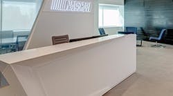
TMA recently designed a new Manhattan office space for NASCAR, the organization’s first New York City presence. The design team heavily branded the office through NASCAR photography and artwork, as well as through the architecture of the physical space.
“We did this visioning session,” Barr recalled, “and they were a very strong-minded client who said, ‘We don’t want to be perceived as gritty. We’re actually a very sophisticated organization. We’re slick. We’re fast. We’re all these things that embody the actual sport itself.’”
As such, the contemporary, minimalist space reflects a fast-paced organization in which every form, object, color, material, and light were selected to unify the identity of the NASCAR brand. For example, the ceiling above the reception area features dynamic, curvilinear forms representative of the racetrack itself. Walls are angular to connect the floor and ceiling dynamically, and the floor is concrete and has integrated metal inlays that mimic the identical layout of the ceiling pattern on the floor.
A custom-designed reception desk, lighting fixtures, a digital branding wall, and a meeting space built inside of a reflective cube are highlights. The facility, consisting of five executive offices, open workspaces, and support functions including boardrooms, feature a rich but minimal color palette that really lets these elements stand out.
Initiative Media
The challenge with global advertising and marketing firm Initiative Media was designing a space that reflected the many brands the company represents, which resulted in a story about the client’s energetic corporate culture.
PageBreak“What we ended up with is just this really eclectic space,” Barr explained. “This was one of those jobs where really there was—other than budget constraints and a schedule—no design constraints whatsoever.”
Divided into four distinct neighborhoods, TMA proposed utilizing the client’s four key marketing words (fast, brave, decisive, simple) as wayfinding and identification devices for each zone.
Stepping out of the elevator into the bright yellow lobby, the energy of New York City is palpable thanks to a dynamic string art logo. A neon sign exclaiming, “Mmmm … beer,” announces the Beer Garden, which, with its reclining wood benches inspired by the city’s stunning High Line park, offers a more relaxed work area. Inspired by the grandstands that line Herald Square during the Macy’s Thanksgiving Parade, TMA created Initiative’s own “Grandstand” with oversized tiered seating that is suitable for small group meetings, individual quiet work, larger town-hall type gatherings, and even musical performances. At the opposite end of the space is another communal area, “The Pit,” created primarily as a working lunch area. The team room’s “billboard” announces the neighborhood’s name and is lined with bold camouflage wallpaper designed by the late art legend and native New Yorker Andy Warhol.
Compass
Unlike the previous two projects highlighted, both of which possessed distinct identities, real estate startup firm Compass was a different story altogether with not much of a brand identity to work from, Barr noted.
“Here, we were building a brand, but it’s almost a neutral brand,” she explained. “You could be in an advertising agency or you could be in a tech firm. This is almost a different interpretation of branding. Some brands should be very quiet, and not in your face, and actually not speak much at all, because that’s maybe what the firm is. The firm might just be simple and elegant, and it’s really just about great space for the staff.” Such was the case with Compass.
With that, the goal with this project was to reinforce the client’s values in its new space while preserving the original architecture and character of the building interior. Features like Romanesque columns with cornices and friezes along the beams were kept intact and highlighted, adding to the clean and comfortable atmosphere. The appearance was kept very simple and clean, with furniture colors, accents, and careful and savvy placement of graphic wallcoverings that provided pleasing contrasts to the neutral wall and ceiling colors. The custom millwork and wall paneling in the elevator lobby became a very unique and organic piece of the design.
In the end, these diverse projects all tell a similar story: that branding is more than image; it’s the tangible interpretation of identity—no matter how subtle or bold.


